Restaurant / Reno, Nevada
Café Whitney
Good food.
A little less to do.
Restaurant campaigns with room for a clear promise and a generous image. A full-page holiday ad, followed by a new menu’s complete social family.
Explore the work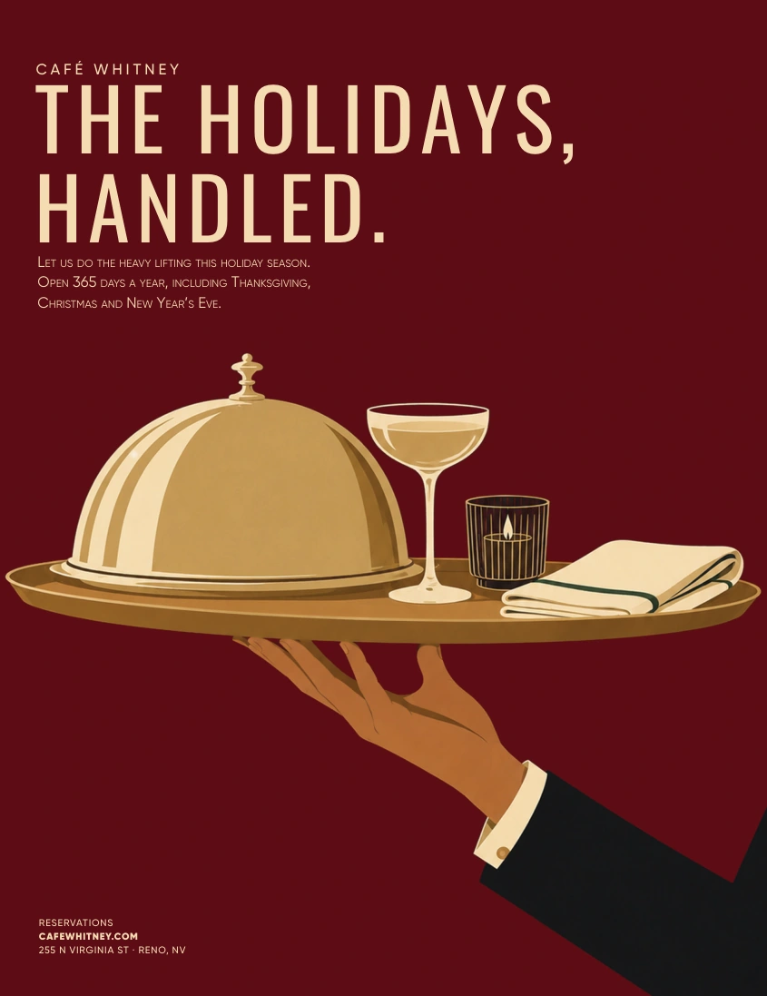
01 / The holiday ad
Let the café do
the heavy lifting.
The brief was a full-page holiday ad for Edible Reno Tahoe. Without a seasonal tablescape photograph, an art-led hospitality scene brought the idea together in burgundy, cream and gold.
One hand carries the whole occasion. The restrained headline leaves the image to explain the rest.
Final print artwork prepared for the November/December placement.
02 / The spring menu
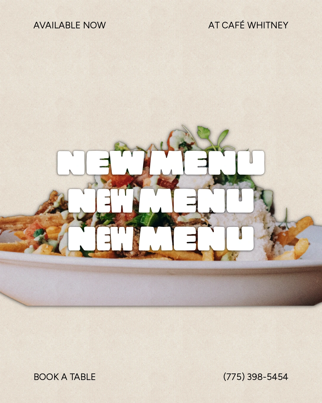
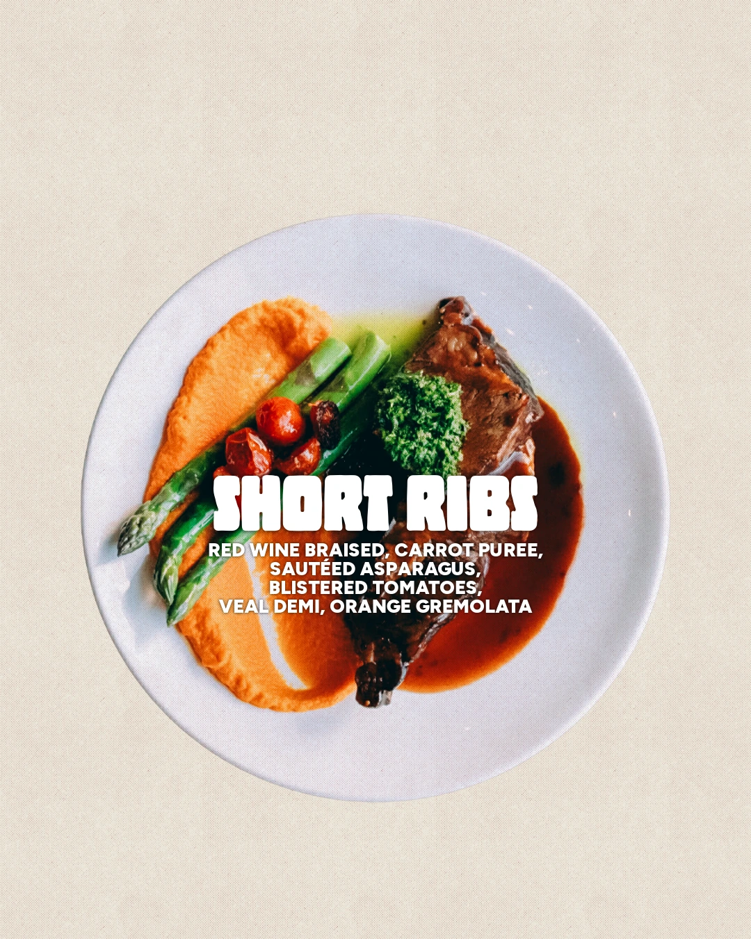
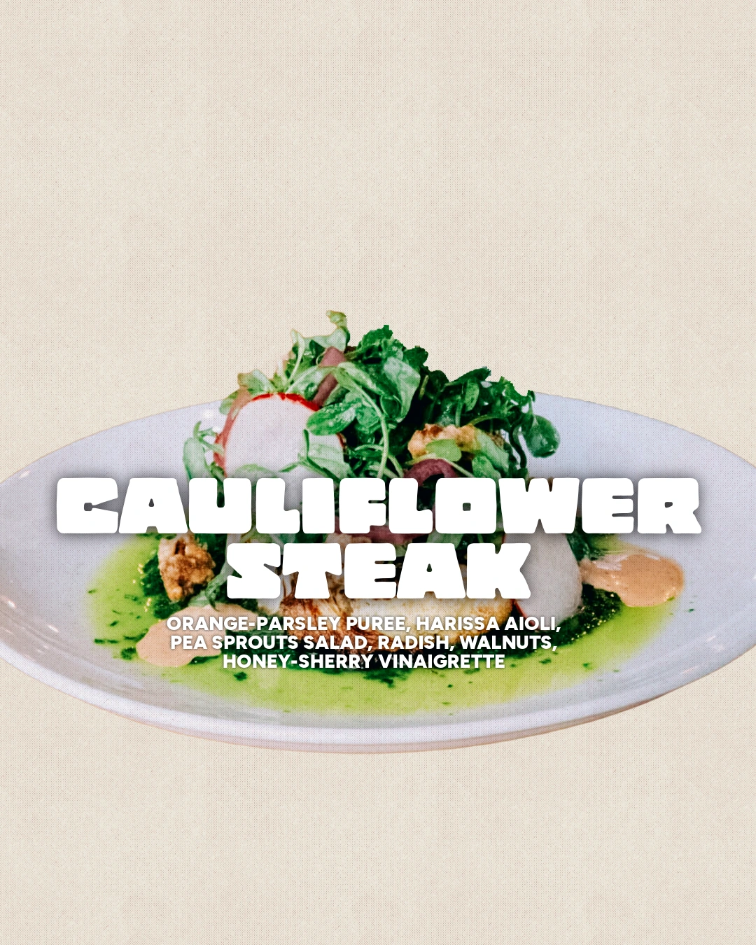
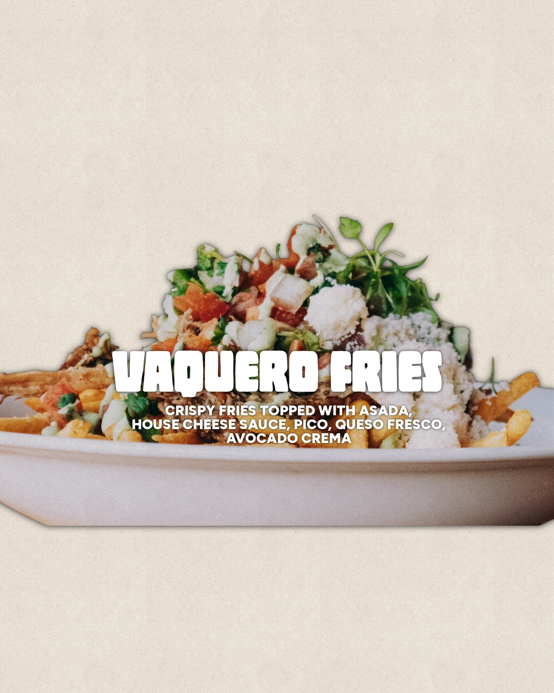
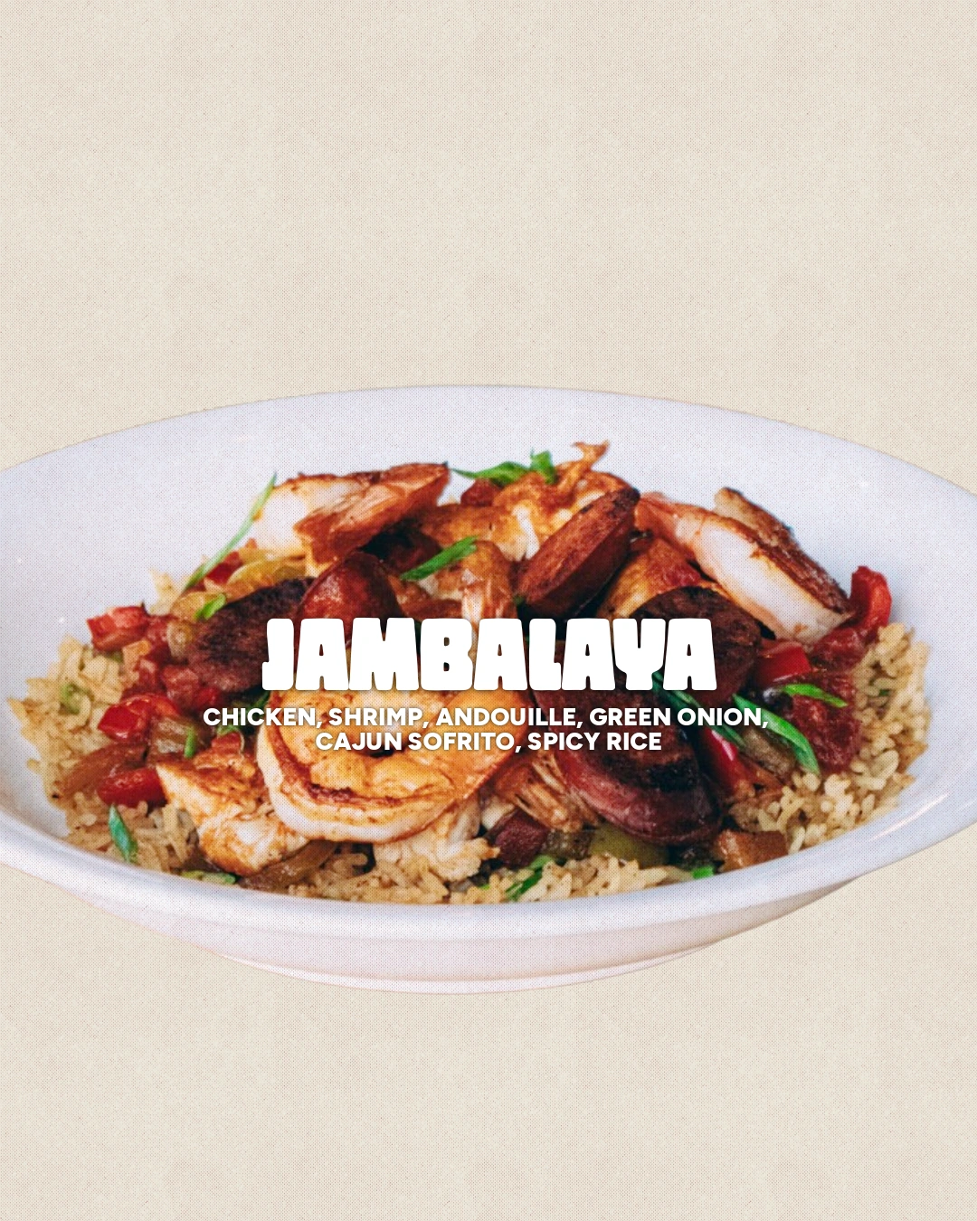
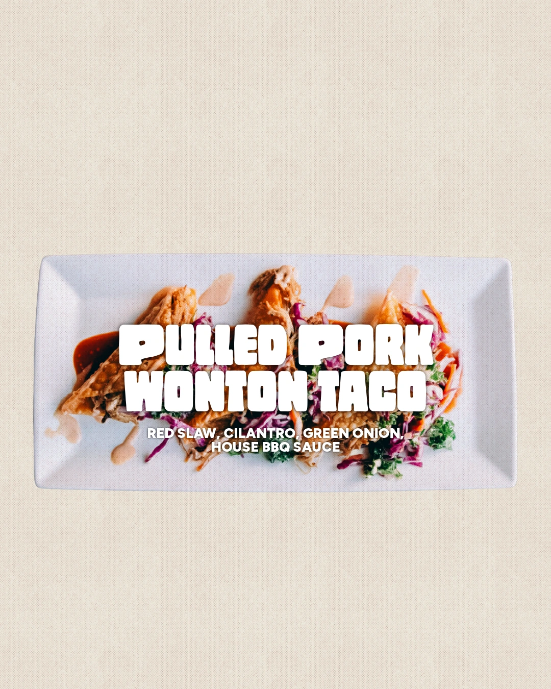
A cream textured field, chunky white type and supplied food photography tie the family together. The cover announces the new menu; each dish gets its own turn.
03 / From feed to Story
A little more
breathing room.
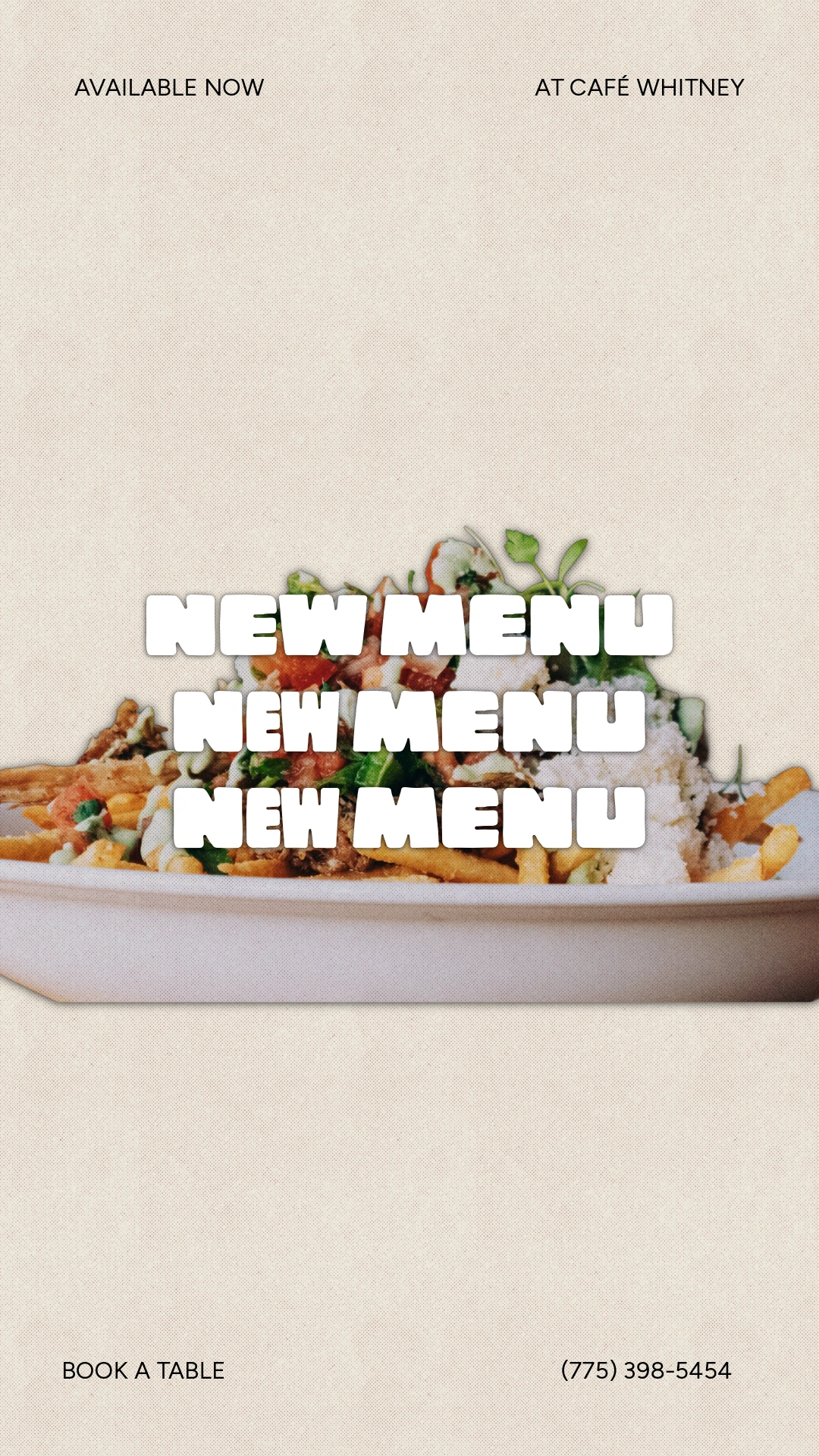
The same cover in two actual delivered formats. The Story separates the top label, food and headline, and reservation information over a taller canvas.
A closer look
Let the food
fill the frame.
The low plate crop leaves room above, while the white lettering sits close to the food. It is a simple arrangement that carries through all six cards.
Campaign design using supplied food photography.
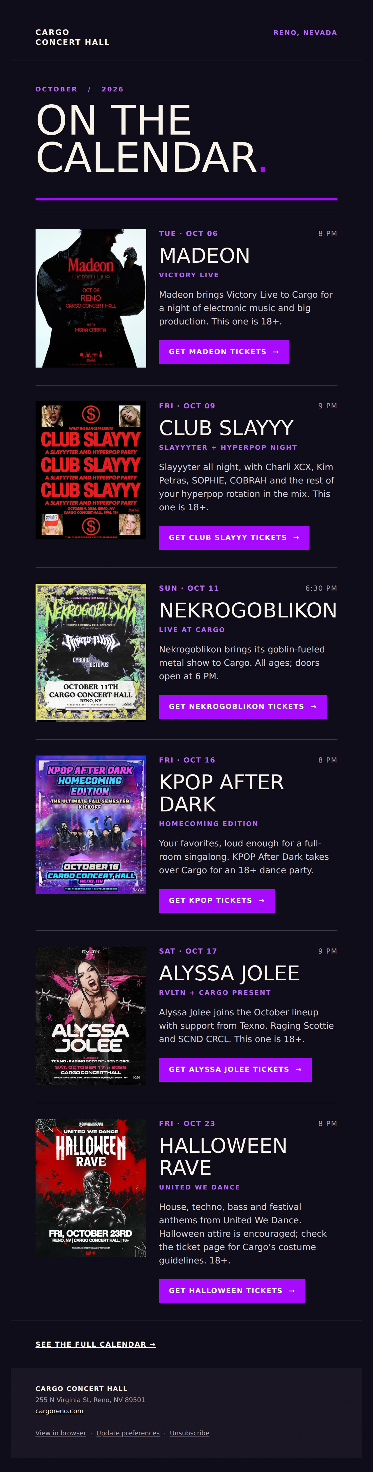
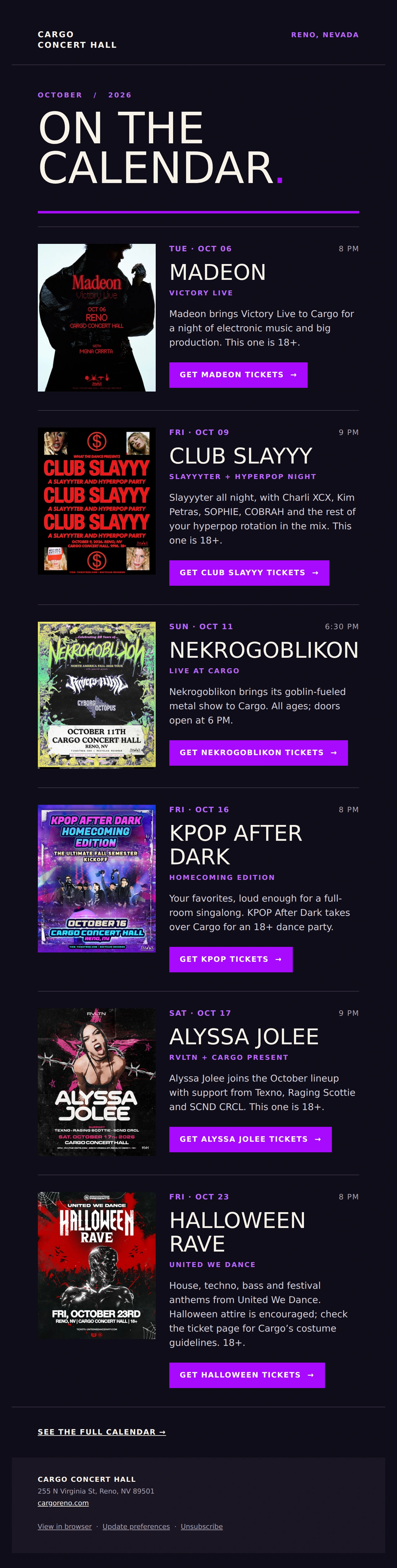
The same address. A bigger story.
Four brands.
One relationship.
Café Whitney is one part of our ongoing work for Whitney Peak. Explore the hotel, restaurant, climbing gym and concert hall together.
See Whitney Peak & company Back to all work