Alexander Del Rossa
Everyday comfort.
A connected identity for Alexander Del Rossa, carried from the garment label to the product page.
Brand identity / Packaging / Amazon content / Digital graphics
Alexander Del Rossa
Duckfat Chorizo

01 The wordmark
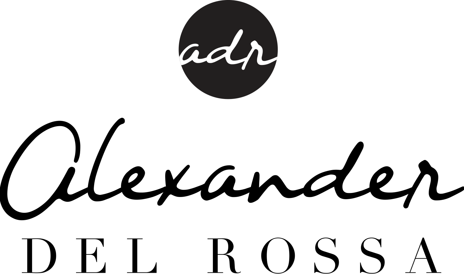
The signature.
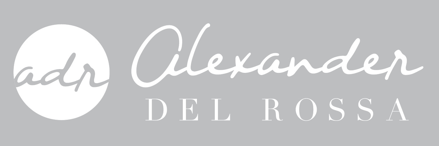
A flowing first name, grounded by a more formal surname.
02 Refining the wordmark
Refining the signature.
The original third-round notes describe a more upright angle, clearer strokes and a refined capital A. The focus was legibility without losing the signature's character.

A more upright stance
Less acute letter angles.
Clearer letter shapes
Refined strokes for legibility.
A refined capital A
Less dramatic, with character retained.
03 Monogram and lockups
The compact mark.
The ADR monogram carries the identity into smaller spaces. In the secondary lockups, the circular mark sits above the name or to its left, as set out in the original guidelines.


04 Color and typography
The supporting language.
Teal, cool gray and black give the system a restrained palette. Nightwind and Didot are the typefaces named in the original guidelines.
Nightwind: script, headlines in upper and lower case. Didot: serif, secondary headings and text in capitals.


05 On the garment
Details that travel with it.
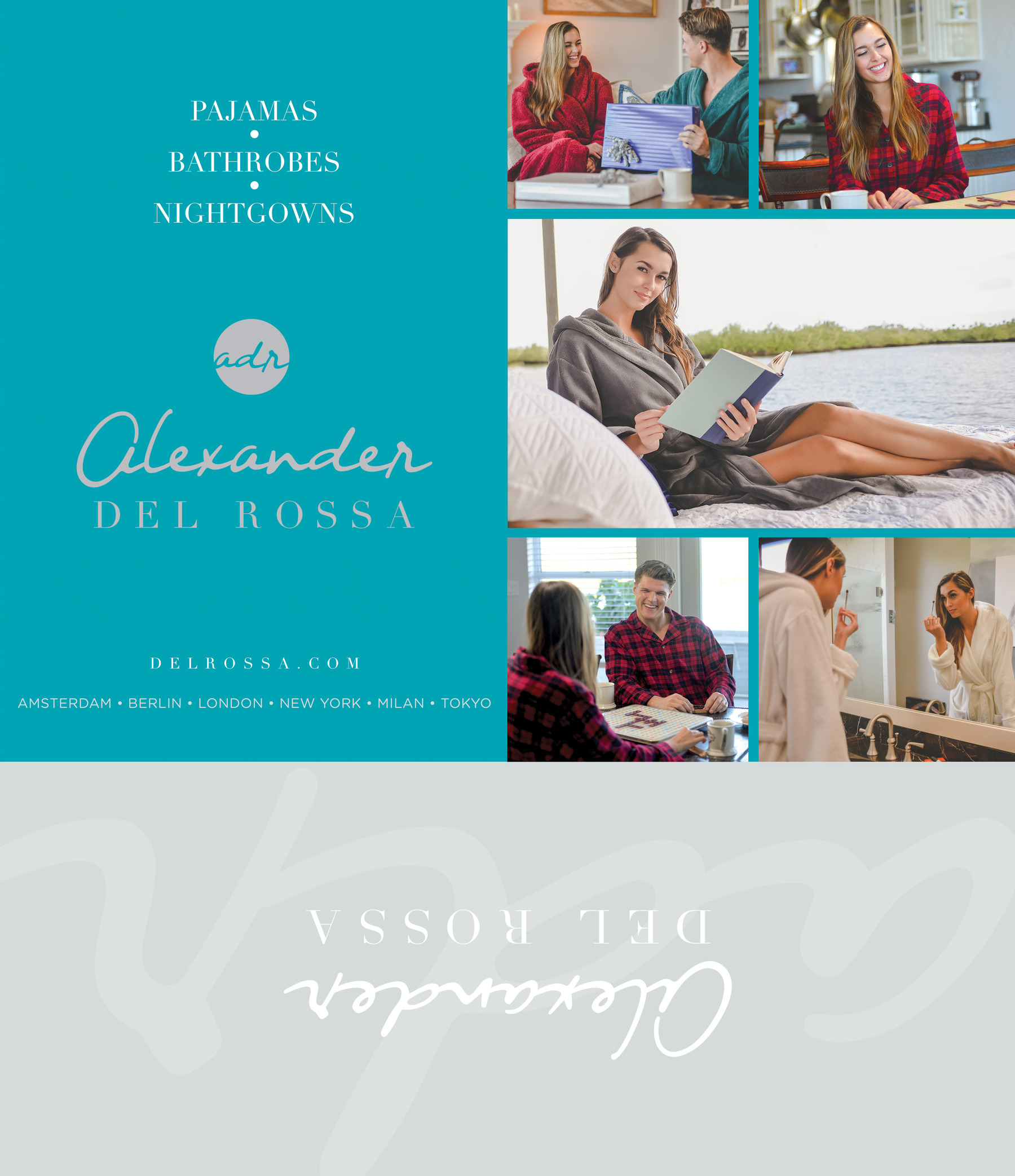
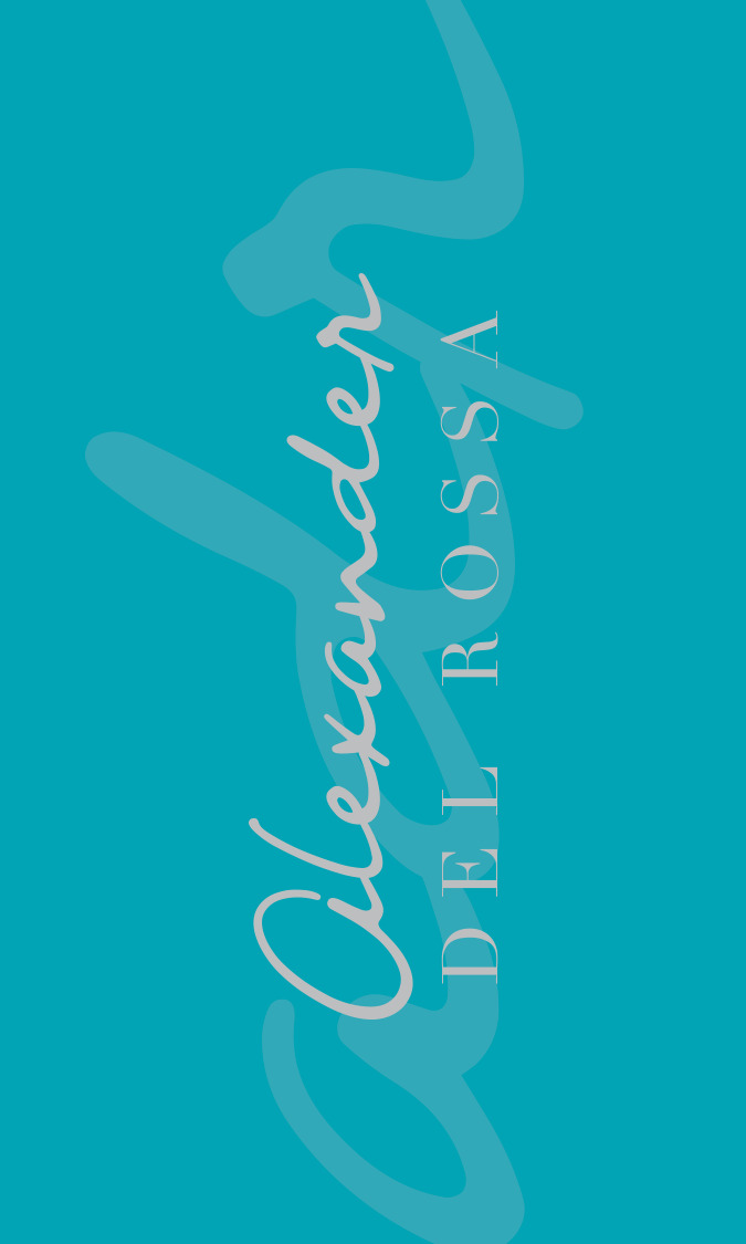
Hang tags, a sewn-in label and packaging inserts extend the same identity beyond the screen. The teal and gray palette keeps the family recognizable across very different formats.
A quieter reverse gives the expressive hang-tag front room to work.
06 The product page
Helping shoppers choose.
Amazon Enhanced Brand Content uses a repeatable hierarchy: product first, features next, then the details shoppers need to compare. The same teal bars and serif headings connect every panel.
The hero panel pairs the robe with concise feature copy and a warmth scale. A companion panel brings color options and the size chart into the same visual language.
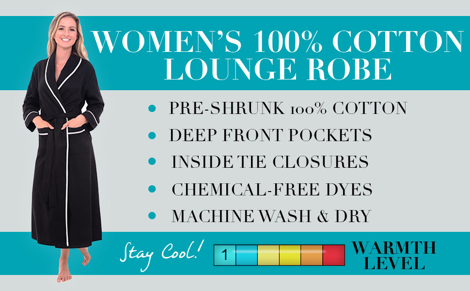
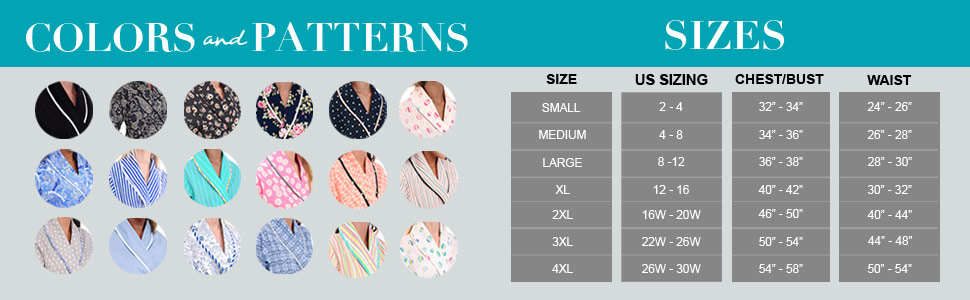
Historical product claims, sizing and options are shown as part of the original artwork, not as current retail information.
07 Shopping the range
More ways to settle in.
The product story continues beyond one robe. Coordinated category graphics and a cross-sell panel connect complementary styles without changing the brand language.
A shared type hierarchy makes the range feel related, while photography carries the mood of each category.




08 Through the seasons
Room for a change of mood.
Seasonal graphics keep the same recognizable composition while color and product selection shift. Winter, spring and holiday treatments show how the identity adapts without starting over.
The logo and typographic structure stay familiar across product, category and seasonal assets. The breadth comes from the applications, rather than a separate look for every message.


09 The whole picture
A brand built for everyday use.
The work forms a connected visual toolkit: identity, garment details, packaging and e-commerce content. Each application gives the same brand a different job to do.

Brand identity, packaging and digital design by Duckfat Chorizo. Photography supplied by the client.
Product references and contact details in historical artwork are not current offers.
← More from the studio